02
4 Website Features that Appeal to New Patients

In most markets, patients have options. Before selecting a new dental, ortho, or specialty practice most people perform a fair amount of research. Factors like location, hours and a practice’s area of specialty all contribute to a prospective patient’s decision-making process.
Still, there is often plenty of overlap amongst competing practices in these broad types of categories. That’s why having unique and custom website features is crucial for standing out from the competition.
In this post, I will cover four website features that help practices stand out relative to their competitors.
1. Customized Look and Content
Having a website with a unique look and feel seems like an obvious necessity, right? Well, in reality, most practices have cookie-cutter websites that do little to differentiate them from competitors.
Website visitors make up their minds REALLY QUICKLY – often within seconds. If a prospective patient can’t determine why your practice is the best option for their needs they will leave your website ASAP.
That’s why having a distinct look and feel combined with obvious navigation is so crucial. The design and copy must be clear, concise, and appealing. People will consider a practice’s personality and style when making their decision, so make the messaging and visuals very apparent right away.
2. Obvious Calls-to-Action
Great content must be supported by action. Once a prospective patient lands on a website and it’s apparent the practice is a possible fit for their needs it’s time for the next step.
Great websites clearly show people what the next step in the process should be. This can be done with strategic call-to-action placement. For example, a practice website’s homepage should have a front-and-center button or obvious link inviting the person to “Contact Us” or even “Get a Free Consultation!” if one is available.
In short, don’t make people guess what the next step is. Show it to them!
3. Virtual Consultation
One of the most effective calls-to-action available is a complimentary virtual consultation.
During the research phase, prospective patients are understandably apprehensive. Sure, a practice’s website and reviews may sound great but a person can’t really know how the fit for their individual needs will pan out until they begin in-person visits.
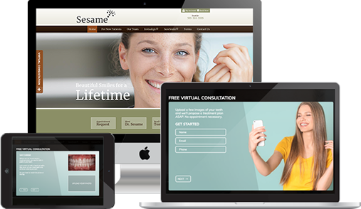
Yet, with a virtual consultation set up a practice can provide some simple initial treatment recommendations before the first in-person visit occurs. Using virtual consultation, a prospective patient enters a portal on the website, uploads a few images capturing different angles of their teeth, and sends them to the practice. In turn, the practice reviews the images and provides a basic consultation.
Here’s a staged version of how it can look:

Beginning the patient and practice relationship with professional guidance before an in-person visit is a great way to help build initial trust and value in the prospective patient’s mind. Naturally, both are key elements of a person’s decision-making process so having a virtual consultation option can be a powerful tool for persuading prospects to become patients.
4. Tap to Text
Not everyone prefers to reach out to a practice via a contact form or phone. Having a built-in tap to text option gives current and prospective patients the ability to text your practice directly from your website. Younger generations especially prefer text messaging for communication purposes so offering it as a contact method provides a practice website with additional appeal.
At Sesame, we can take functionality even further by offering websites that include tap to text that integrate with a practice’s patient communications system to set up a virtual waiting room. The resulting virtual experience helps reduce germ exposure for both staff and patients.
With a customized appearance and messaging, a clear call-to-action, virtual consultation to instill trust from the outset, and great features like tap to text a practice website stands an excellent chance of appealing to prospective and existing patients.
Is your practice’s website in need of an upgrade to account for useful features such as these? Sesame can help!
Sesame is the custom-designed dental website industry leader. With nearly 2 decades of experience, Sesame knows how to build websites that attract new patients and provide great features for existing ones.
To learn more, simply click the button below to contact Sesame and get a FREE website evaluation!
—Mike Fitterer, Sr. Marketing Manager II, Sesame Communications

